Designs
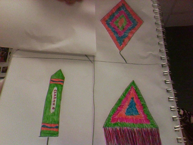
Three of my kite designs. These ones are made with colorful pens. They might not look like it but they are supposed to look tie-die.
|
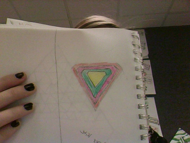
One of my kite designs. It is called a super kite and is make with colored pencils.
|
My Kite
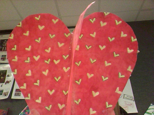
The main part of my kite with the fin.
|
The body of my kite. Its mainly orange with yellow hearts outlined in pink and blue.
|
Pattern and Rhythm
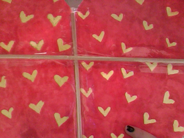
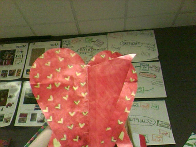
A close-up on the back of my kite. The yellow hearts are not outlines by the pink and blue on the back. The back also has my dowels.
|
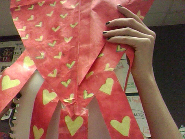
these are the tails on my kite. They are orange and have yellow hearts.
|
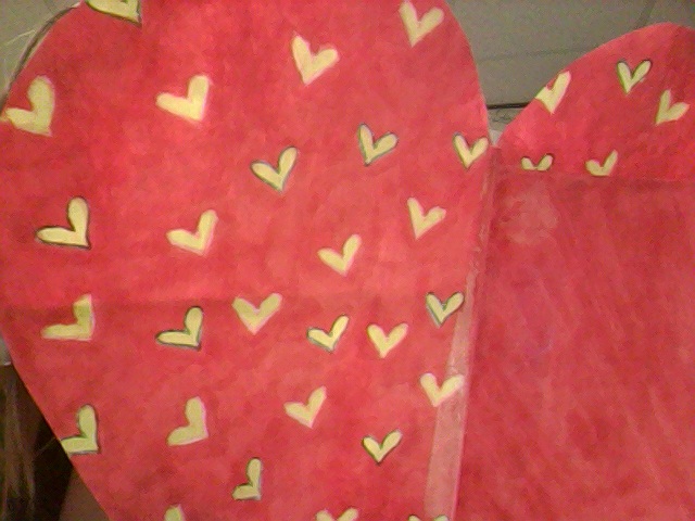
This is the pattern of my kite. It is all orange with yellow hearts outined in pink and blue.
|
Kite Reflection. Feb. 4th 2013
1.) I think that my coloring was the best part of my kite. I think its the best part because all my strokes went the same way.
2.) I think that I could have changed my pattern because it is really boring and dosnt stand out.
3.) The theme of my kite is hearts. The overall look is a big kite filled with many smaller ones. I chose to do it this way because it was a unique idea but still really simple.
4.) The shape of my kite is a heart. I chose this shape because agian it is very simple but something that no one else was going to think of.
5.) The major color that I used was orange. It had a lot of yellow in it as well. Some of the simple colors in it are the blue outline of the hearts as well as the pink.
6.) I used sharpies and ink pads. I dont really like useing the sharpies because once they hit the paper you couldnt change it, so when I didnt like my color I couldnt go back and change it. The advantage of the sharpie it that they are bold and the thick ones have an advantage over a regular small marker.
7.) I learned to not get so angry at myself when it goes wrong. I also learned that being responsibe and always come to school inless you absolutly cant because it gets you behind. That can be applied later in life when I have a job.
8.) The first thing that I did was make my designs. The next thing I did was pick the design I wanted and make the mock-up. After that was done I cut out the paper and started coloring and making the tails and fins.
9.) I do think this was a good project because it taught me more than the typical things you learn in art. It taught me measurement and other skills that you usually dont use in art. I think that in the next few years if you decide to do this project I would make it in like a processed step by step thing, so that everyone is on the same page.
